
Client Project | Branding & Visual Design
Brewline Café is a late-night coffee brand designed for night owls, students, and creatives who seek a cozy yet energizing space after hours. The objective of this project was to create a distinctive brand identity and engaging social media visuals that communicate the café’s unique late-night personality, encourage foot traffic, and build strong brand recognition.
Client: Brewline Cafe
Industry: Food & Beverage
Platform: Illustrator
Deliverables: Logo Design, Social Media Post Design, Visual Branding Direction
Project Goals
Create a memorable logo that reflects the café’s late-night concept.
Build a strong and recognizable brand identity.
Communicate the café’s operating hours and new product launches clearly through social media.
Attract students, creatives, and late-night customers.
Maintain visual consistency across branding assets..
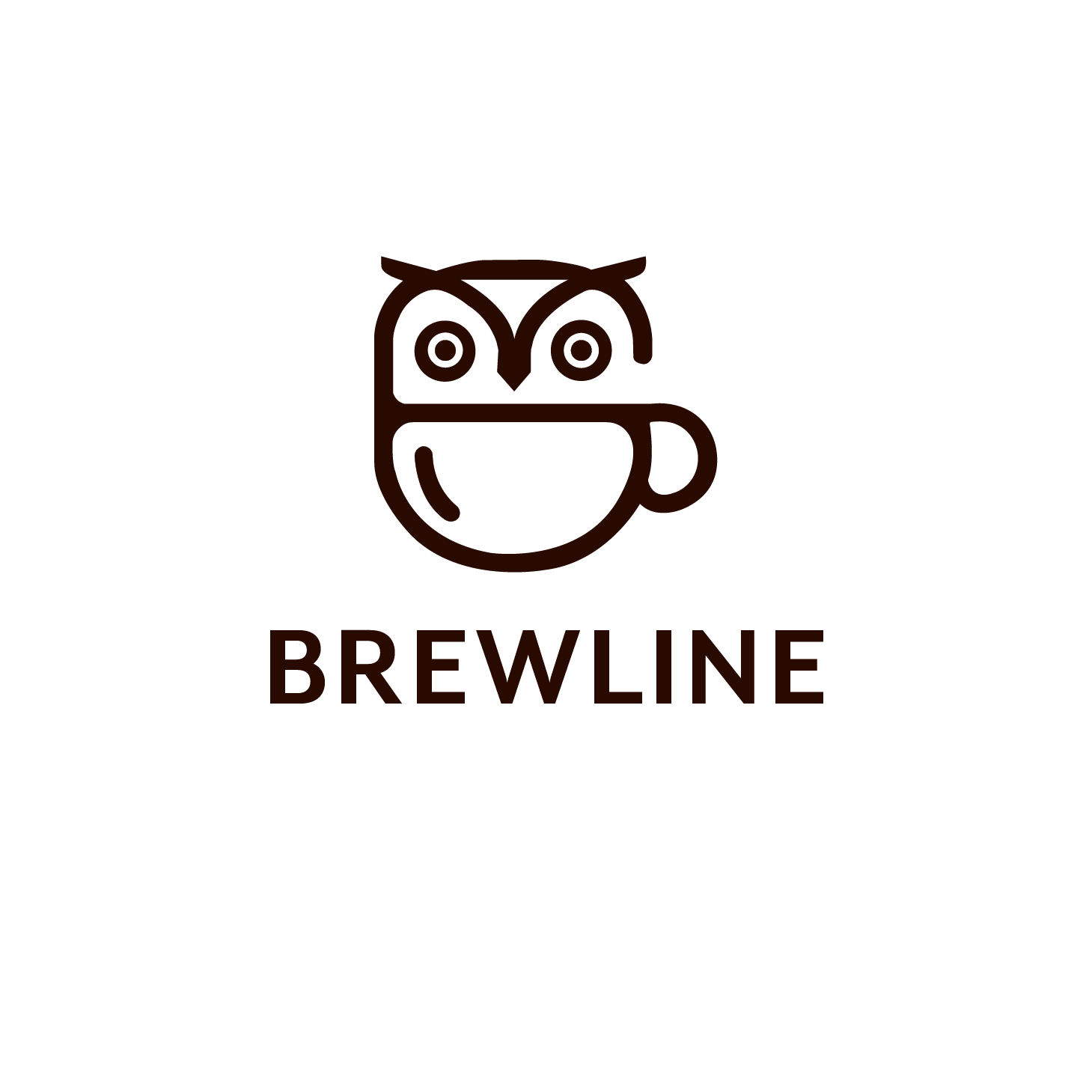
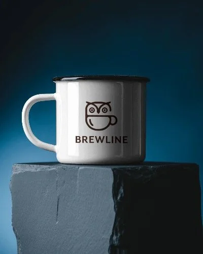
Logo Concept & Visual Identity
The logo was designed as a line art combination of an owl and a coffee mug, symbolizing alertness, creativity, and late-night energy.
A brown color palette was selected to represent warmth, comfort, and the richness of freshly brewed coffee. Brown also adds an organic, grounded feel that balances the energetic late-night concept while keeping the brand approachable and cozy.
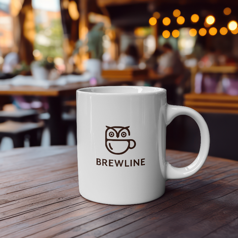
The line art style keeps the logo minimal, modern, and highly versatile, allowing it to scale easily across digital platforms, packaging, and signage while maintaining clarity and consistency.

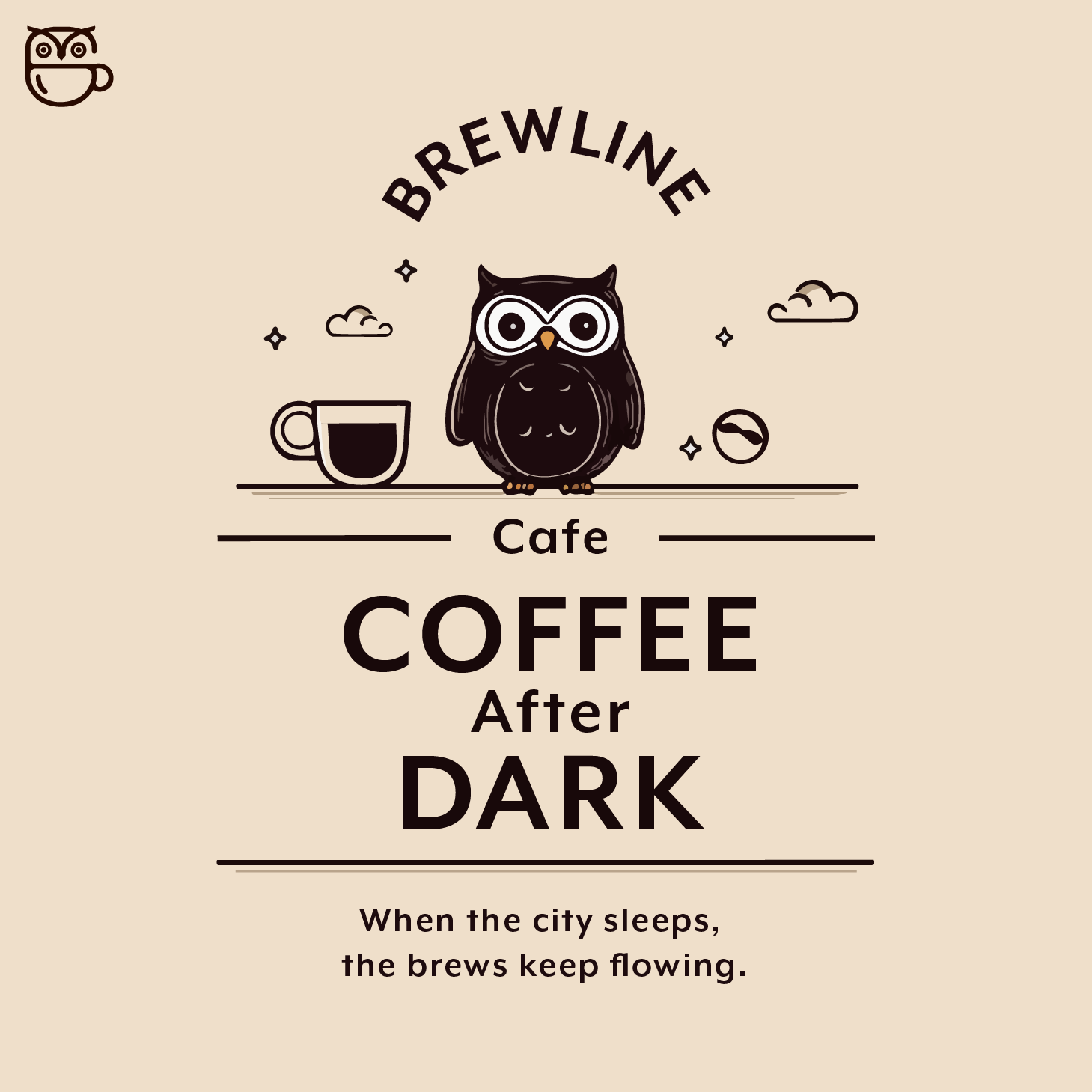
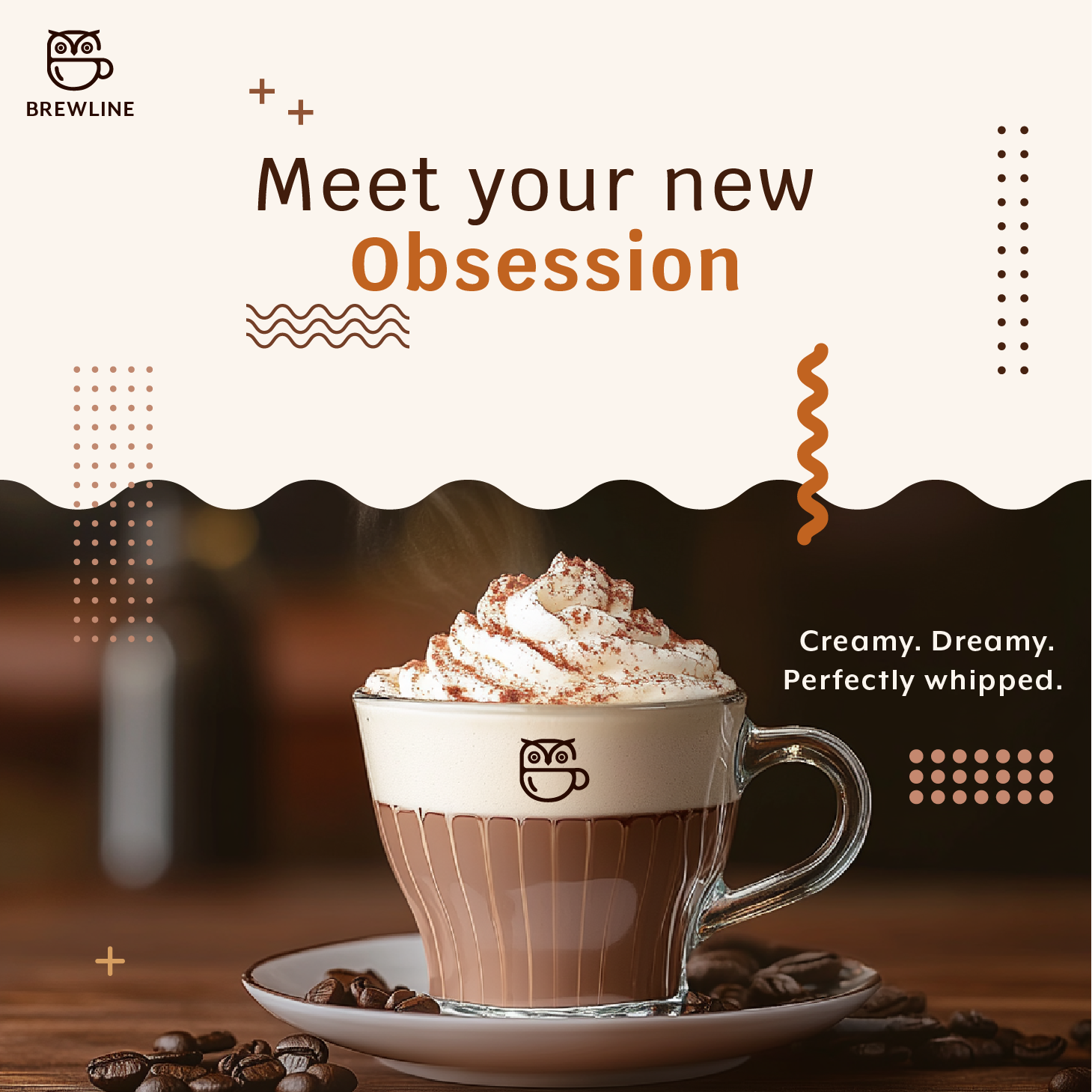
Social Media Design Strategy
The social media posts were designed to highlight two key business messages:
Open Till Late Night — reinforcing the café’s unique operating hours and positioning it as a go-to destination for late-night coffee lovers.
New Drinks Launch — generating excitement and encouraging repeat visits through visually engaging promotions.
The layouts focus on bold typography, clear messaging, and strong visual hierarchy to ensure readability across mobile screens. The designs maintain brand consistency through color usage, minimal composition, and cohesive styling, helping the brand remain recognizable across platforms.